There's a reason getting dressed in spring feels different from any other season. The air lightens, the world shifts into softer focus, and suddenly your wardrobe wants to catch up. But knowing which colors to reach for — and how to actually wear them — is where most people get stuck. The spring color palette is one of the most versatile and flattering in fashion, built on a foundation of light, warm, and luminous hues that feel effortless when styled right.
Whether you're drawn to creamy butter yellows, dusty rose blush, warm mint greens, or soft lavender, spring dressing is all about embracing color with a light touch. This guide breaks down everything you need to know: the core colors that define a spring palette, how to match them to your skin tone, how to build real outfits around them, and how to stay ahead of the season's most talked-about color trends. By the end, you'll have a clear, actionable roadmap for dressing in spring's most beautiful shades — with confidence.
What Is a Spring Color Palette?
A spring color palette refers to the group of hues that visually evoke the season's defining qualities: freshness, warmth, and lightness. In color theory and seasonal styling, spring palettes are characterized by their high luminosity and warmth. These are not the deep, saturated jewel tones of autumn or the icy, stark hues of winter — spring colors carry a soft glow, as if they've been kissed by morning sunlight.
The concept has roots in the "seasonal color analysis" system developed in the 1980s, which categorized complexions and wardrobes into four seasonal types. The spring category is defined by warm undertones and clear, bright-yet-soft tones. Think less "neon pop" and more "flower petal." This palette rewards those who lean into delicacy rather than drama, though that doesn't mean spring dressing has to be boring — far from it.
Understanding your spring palette gives you a shortcut to getting dressed. Instead of staring at a full closet feeling overwhelmed, you have a curated color language to work from — a set of hues that naturally harmonize with each other and with a wide range of skin tones.
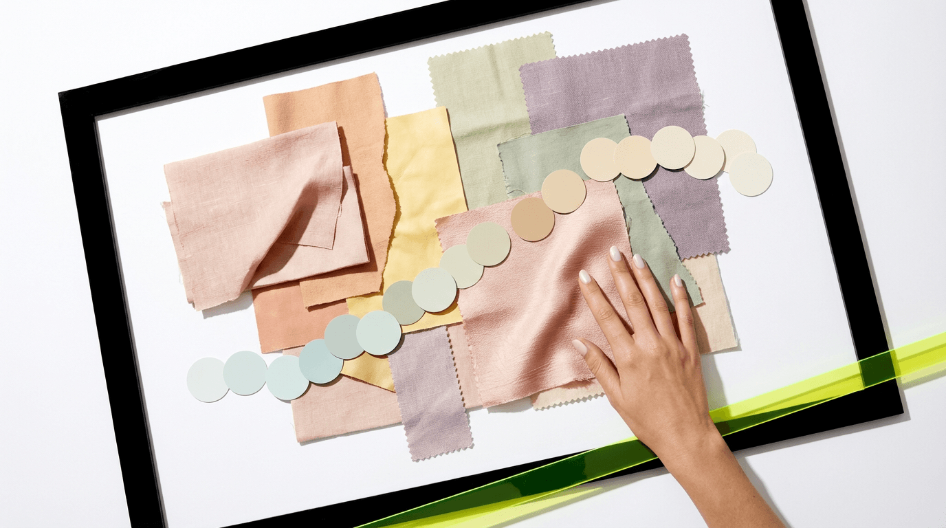
The Core Colors of a Spring Palette
Spring palettes span a surprisingly wide range, but they all share that warm, luminous quality. Here are the signature shades to know:
- Butter Yellow: A warm, creamy yellow with golden undertones — softer than canary yellow, richer than ivory. It's the color of daffodils and morning light.
- Blush Pink / Dusty Rose: Not a bubblegum pink or a hot pink — spring's pink is muted, warm, and rosy. It pairs beautifully with both neutrals and other pastels.
- Mint Green: Fresh and cool-leaning, mint still reads as spring because of its lightness. It works as both a statement piece and a subtle accent.
- Peach and Apricot: One of the most universally flattering spring shades. Peach sits at the intersection of pink, orange, and gold — inherently warm and glowing.
- Soft Lavender: The cooler edge of the spring palette, lavender brings romantic softness. Pair it with warm tones like peach or butter yellow to keep it grounded in the season.
- Sky Blue and Baby Blue: Light, clear blues with a warm or neutral undertone. Think of the color of a cloudless spring morning rather than a steel winter sky.
- Warm White and Cream: True spring neutrals. Warm whites have a soft golden or ivory cast that feels lived-in and luxurious, unlike the crisp, stark whites of summer.
- Caramel and Light Tan: Earthy warm neutrals that anchor brighter spring colors without pulling the palette into autumn territory.
The magic of these shades is how naturally they interact. A butter yellow linen shirt over a blush pink skirt. Sky blue trousers with a cream knit. Peach and lavender together in a printed wrap dress. Spring's color story is one of harmony, not contrast.
Warm vs. Cool Spring Shades: What's the Difference?
Even within the spring palette, there's a spectrum between warmer and cooler hues, and understanding this distinction helps you shop more intentionally. Warm spring shades — butter yellow, peach, apricot, caramel, warm white — pull toward golden and orange undertones. They have an inherently sunny, inviting quality and tend to be especially flattering on those with warm or golden skin undertones.
Cool-leaning spring shades — lavender, mint, baby blue, some dusty roses — have subtle pink or blue undertones but remain light enough to stay within the spring family. They tend to suit neutral-to-cool complexions particularly well. The key differentiator between a "spring" cool shade and a "winter" or "summer" cool shade is brightness and value: spring cool tones are clear and light, never gray or muted in a somber way.
When building a spring outfit, mixing both warm and cool shades from the palette creates beautiful, balanced looks. The warmth of a peach tone can make lavender feel less stark; the coolness of mint can stop an all-yellow outfit from feeling overwhelming. This interplay is what gives spring dressing its signature effortless quality.
How to Wear Spring Colors in Real Outfits
Knowing your palette and actually building outfits from it are two different skills. Here are practical approaches to styling spring's light, warm colors in everyday looks:
Go Tonal for an Effortlessly Chic Look
Tonal dressing — wearing different shades of the same hue from head to toe — is one of spring's strongest trends and one of its easiest formulas. Try blush pink from top to bottom: a dusty rose blazer, a paler pink slip skirt, and nude-pink mules. The subtle variation in depth adds dimension without breaking the palette's harmony. This approach photographs beautifully and works for everything from brunch to office settings.
Use Warm Neutrals as Your Base
Cream, caramel, and warm tan are the unsung heroes of a spring wardrobe. When you're not sure what to wear, starting with a cream linen trouser or a caramel slip dress gives you a neutral canvas that plays nicely with every other spring shade. Add a butter yellow cardigan, a blush pink scarf, or mint green accessories to build from there. Warm neutrals do the heavy lifting so your accent colors can shine.
Try Unexpected Pairings
Spring's light tones are low-risk when it comes to mixing, which makes it a great season to experiment. Lavender and yellow together feel modern and playful. Mint and peach is a fresh combination that's gaining traction on street style feeds globally. Baby blue and caramel read as understated luxury. The lightness of the palette means unexpected combinations rarely clash — they simply create different moods.
Choosing Spring Colors for Your Skin Tone
The spring palette is widely flattering, but certain shades will genuinely make your complexion glow while others may wash you out or compete with your natural coloring. Here's a practical breakdown:
- Fair/Light skin with warm or neutral undertones: Butter yellow, peach, blush pink, and warm white are especially radiant. Avoid going too pale (all-ivory near the face can disappear); instead, let a warm-toned spring shade bring color to your complexion.
- Light-medium skin with golden undertones: Nearly the entire spring palette works beautifully here. Peach, apricot, and caramel are particularly luminous. Lavender and sky blue add contrast without clashing.
- Medium to olive skin: Deeper spring shades like dusty rose, warm tan, and butter yellow complement olive undertones brilliantly. Mint and sky blue create striking, fresh contrast.
- Deep/Rich skin tones: Brighter, clearer versions of spring shades — saturated peach, vibrant butter yellow, clear lavender — tend to read better than very muted pastels, which can appear ashy against deeper complexions. Look for spring shades with warmth and clarity rather than dustiness.
The most reliable way to test how a spring shade performs on your specific skin tone isn't guesswork — it's actually seeing yourself in the color. That's exactly where virtual try-on technology changes the equation. With Alvin's Club's Celebrity Try-On feature, you can upload your own photo and instantly see how spring color outfits — straight from the wardrobes of style icons like Zendaya or Dua Lipa — look on your actual body and coloring before you spend a cent.
Spring Color Trends Taking Over Street Style
While the classic spring palette remains timeless, each season brings new color conversations, and this spring is no exception. Keeping tabs on what's actually hitting the streets — not just the runway — gives your wardrobe a current edge without requiring a full refresh.
This season, butter yellow has graduated from accent to statement. Monochromatic yellow sets in lightweight fabrics are everywhere from Copenhagen street style to New York Fashion Week. Pistachio green — a warmer, slightly muted take on mint — is having a major moment as a versatile alternative to traditional sage or olive. Soft coral is bridging the gap between spring peach and summer orange, showing up in slip dresses, tailored blazers, and knitwear alike.
One of the more unexpected spring trends gaining traction is pale lilac as a neutral. Rather than treating lavender as an accent, forward-thinking dressers are building full outfits around it — lilac trousers, lilac coats, lilac accessories — treating it with the same versatility as beige or grey. It's a shift that makes the spring palette feel genuinely fresh and modern.
Staying on top of these micro-trends in real time is easier when you have a curated feed pulling global street style to you. The Trend Feed on Alvin's Club aggregates emerging street style movements so you can spot which spring shades are gaining momentum before they peak — and build looks around them while they still feel fresh.
Building a Spring Wardrobe Around a Color Palette
The most common wardrobe frustration — having a full closet and nothing to wear — often comes down to a lack of color cohesion. When your wardrobe operates around a clear seasonal palette, everything works together, and getting dressed becomes intuitive rather than stressful.
Start by identifying your three or four anchor spring shades. These should include at least one warm neutral (cream, caramel, or warm tan), one soft pastel you genuinely love wearing (blush, mint, butter yellow), and one slightly more unexpected tone to keep things interesting (pistachio, soft coral, pale lilac). From these anchors, everything you buy should relate back to at least one of them — either matching, complementing, or providing natural contrast within the palette.
When it comes to fast-fashion brands like Zara and H&M, spring collections typically arrive in two drops: early spring (February/March) and mid-spring (April/May). Shopping early gives you access to the widest range of spring palette shades before popular sizes sell out. The Brand Look feature on Alvin's Club lets you browse curated spring looks from these retailers and virtually try them on to see which spring shades actually work with your coloring and your existing wardrobe — saving you from costly impulse buys that end up unworn.
It's also worth thinking about value when expanding a spring wardrobe. If a designer piece in the perfect shade of butter yellow is out of budget, AI-powered shopping tools can surface smart dupes and affordable alternatives that match the same color profile and aesthetic. Finding affordable alternatives to luxury spring looks is one of the smartest ways to dress well in seasonal color without overspending.
Try Spring Looks Virtually Before You Buy
One of the biggest barriers to buying in spring colors — especially for people who typically default to neutral wardrobes — is uncertainty. Will blush pink actually work on me? Does butter yellow wash out my complexion? Is mint too bold for everyday wear? These are fair questions, and the traditional answer (buy it, try it at home, potentially return it) is both time-consuming and wasteful.
Virtual try-on technology has fundamentally changed this calculation. Rather than guessing how a color will interact with your skin tone, hair color, and body proportions, you can see an accurate preview of yourself in a complete spring outfit before purchasing. This isn't just convenient — it genuinely shifts how confidently people dress in new colors. When you've already seen yourself in butter yellow and loved it, buying the butter yellow blazer feels like a certainty rather than a risk.
For personalized spring outfit inspiration tailored to the current season — including daily OOTD suggestions built around your virtual wardrobe and the spring palette — the Outfit Journal feature on Alvin's Club does the daily styling work for you. It factors in your existing pieces, current trends, and seasonal colors to surface looks that feel effortless — solving wardrobe paralysis one curated outfit at a time.
Start Dressing in Spring's Best Colors
The spring color palette isn't complicated once you understand its core logic: light, warm, luminous hues that work in harmony with each other and with a wide range of skin tones. From butter yellow and blush pink to mint green and soft lavender, this season's colors reward those who embrace them with outfits that feel fresh, intentional, and genuinely flattering.
The key is moving from knowing the palette to actually wearing it — experimenting with tonal looks, grounding bright shades in warm neutrals, and staying curious about unexpected color pairings. And when uncertainty about a color creeps in, the best tool you have is the ability to actually see yourself in it before committing. That's the difference between a wardrobe built on guesswork and one built on confidence.
See Yourself in Spring Colors — Before You Buy
Stop guessing which spring shades actually work for you. With Alvin's Club, you can virtually try on complete spring outfits — from celebrity looks to fast-fashion finds — and see in real time how light, warm colors work on your own body. No risk, no returns, no second-guessing.
Explore Alvin's Club Download the App